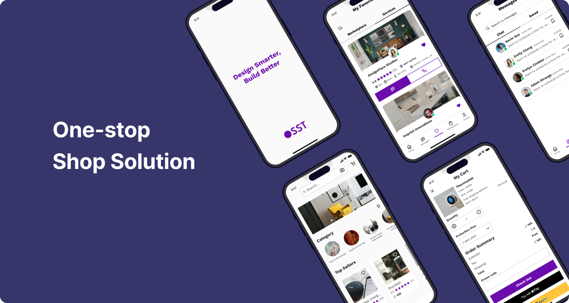
Reimagining Home Furnishing Experience
UX Intern ✴ Winter 2023
Context
Currently, clients with home projects must engage with multiple professionals from various fields, including architects, interior designers, painters and builders, to accomplish the project. this process can be cumbersome and inefficient due to the necessity of liasing with several professionals.
The OSST platform introduces a convenient in-app messaging service and incorporates a business directory, where customers can discover skilled architects, interior designers, tradesmen, handyman and more.
As a design intern on the team, I designed the messaging interface and collaborated with other designers on 3 other features of the app. Over the course of 3 months, I worked alongside a product owner, three other junior designers, and received guidance from a senior designer.
Scroll to see the process ↓
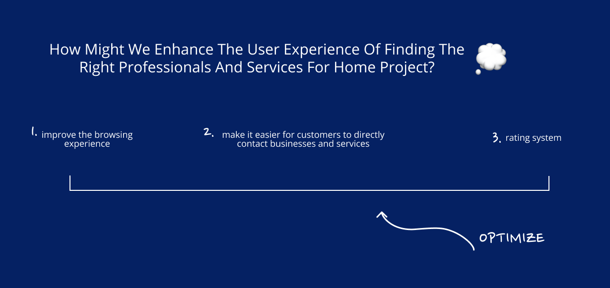
Questions that we started with
1. How might we connect customers with businesses?
2. How might we find a way for customers to see services/ professional profiles all at once and to locate the service they want?
3. How might we create a review system for feedback and ratings?

Competitive Analysis
I did competitive analysis on existing home furnishing services and their mobile apps as well. Listing down their advantages and gaps that we can fill, we found the the potential to differentiate ourselves by enabling users to seamlessly and simultaneously engage with multiple professionals and services.
Research
I conducted 8 user interviews to hear their thoughts on home furnishing/renovating projects. This is what they said:
1.“It is kinda annoying that I would have to contact multiple businesses and studios…”
2. “I wish to see the prices for services immediately, but it is often hard to see…”
3. “…exploring different options can be time-consuming”
Narrowing down the goal

Ideation
Usability Testing
10 users, KPI: Usability Score on a scale of 1-10
While we relied on heuristic principles to guide our decision-making process, we recognized the importance of validating our hypotheses through testing with actual users. To evaluate whether the user experience flow was intuitive, we conducted usability testing sessions where participants were asked to complete a predefined set of tasks.
For each task, participants were instructed to assign a usability score based on clarity, ease of use, and overall satisfaction. This allowed us to gather quantitative insights into the functionality of each step and qualitative feedback on areas for improvement.
✴ KPI: Key Performance Indicator (Quantitative)
Leveraging insights from my research, I designed detailed wireframes to optimize the functionality and user experience of the messaging feature.
Test Results
The participants identified two key areas for improvement:
The message/calling icon was not intuitive, which led to some confusion during use.
The sizes of the buttons were not optimal and could be adjusted to enhance ease of clicking and overall usability.
Taking these insights into account, I made targeted adjustments to the messaging function. This included redesigning the icons to improve their intuitiveness and resizing the buttons to make them more accessible and user-friendly. These changes aimed to enhance the overall user experience and address the usability concerns highlighted during testing.
Glimpse of High Fidelity Design
Learnings
From the design and technical perspective, I got to learn more about iOS native and mobile interaction patterns. And I also got to learn more about accessibility from the team.
I also learned the importance of designing less for more. While I tried to stack components on a single card, testing proved that the experience is better when it’s simple. This experience tells me that design is more about targeting the right problem and to be straight forward about the solutions.


